# button
## break down of html
Let's break down the html
```html
```
You first add the button element, which consists of an opening and closing tag
```html
```
- The type="button" attribute in the opening button tag explicitly creates a clickable button. Since this particular button is not used for submitting a form, it is useful for semantic reasons to add it in order to make the code clearer and not trigger any unwanted actions.
- The class="button" attribute will be used to style the button in a separate CSS file. The value button could be any other name you choose. For example you could have used class="btn".
- The text Click me! is the visible text inside the button.
## styling button
```css
* {
box-sizing: border-box;
}
body {
display:flex;
justify-content: center;
align-items: center;
margin:50px auto;
}
.button {
position: absolute;
top:50%
}
```
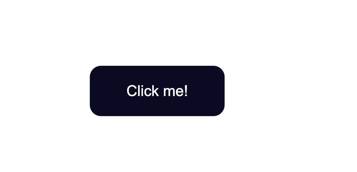
The default styling of buttons will vary depending on the browser
The code from above will result in the following:
![[button 1.png|500]]
### How to Change the Default Styling of Buttons
for each option add to class or id
#### for background color
```css
background-color:#0a0a23;
```
#### for text color
```css
color: #fff;
```
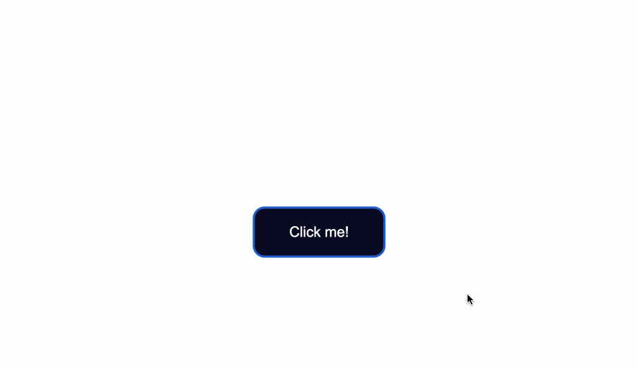
### Change the Border Style of Buttons
#### border color
```css
border-color: #fff;
```
#### having border or not
```css
border: none;
```
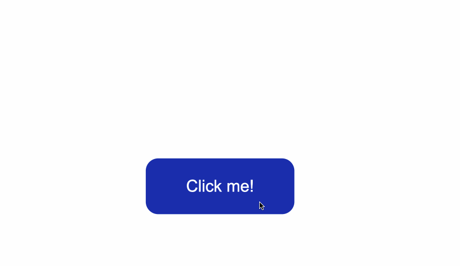
![[button2.png|500]]
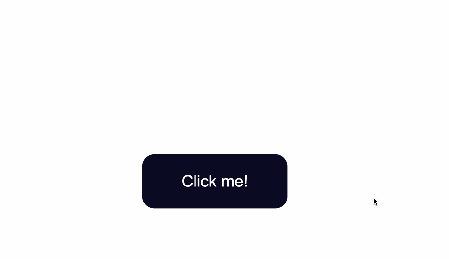
#### round-up the edges of the button
```css
border-radius:10px;
```
![[button3.png|500]]
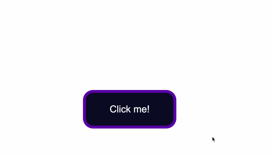
#### slight dark shadow effect around the button
```css
box-shadow: 0px 0px 2px 2px rgb(0,0,0);
```
![[button4.png|500]]
## Change the Size of Buttons
# unsorted
The way to create more space inside the button's borders is to increase the `padding` of the button.
Below I added a value of 15px for the top, bottom, right, and left padding of the button.
I also set a minimum height and width, with the `min-height` and `min-width` properties respectively. Buttons need to be large enough for all different kind of devices.
```css
.button {
position: absolute;
top:50%;
background-color:#0a0a23;
color: #fff;
border:none;
border-radius:10px;
padding:15px;
min-height:30px;
min-width: 120px;
}
```
## How to Style Button States
Buttons have three different states:
- `:hover`
- `:focus`
- `:active`
It's best that the three states are styled differently and don't share the same styles.
In the following sections I'll give a brief explanation on what each one of the states mean and what triggers them. You'll also see some ways you can style the button for each separate state.
### How to Style `:hover` States
The `:hover` state becomes present when a user hovers over a button, by bringing their mouse or trackpad over it, without selecting it or clicking on it.
To change the button's styles when you hover over it, use the `:hover` CSS
pseudoclass selector.
A common change to make with `:hover` is switching the background-color of the button.
To make the change less sudden, pair `:hover` with the `transition` property.
The `transition` property will help make the _transition_ from no state to a `:hover` state much smoother.
The change of background color will happen a bit slower than it would without the `transition` property. This will also help make the end result less jarring for the user.
```css
.button:hover {
background-color:#002ead;
transition: 0.7s;
}
```
In the example above, I used a Hex color code value to make the background color a lighter shade for when I hover over the button.
With the help of the `transition` property I also caused a delay of `0.7s` when the transition from no state to a `:hover` state happens. This caused a slower transition from the original `#0a0a23` background color to the `#002ead` background color.

Keep in mind that the `:hover` pseudoclass does not work for mobile device screens and mobile apps. Choose to use hover effects only for desktop web applications and not touch screens.
### How to Style `:focus` States
The `:focus` state takes effect for keyboard users - specifically it will activate when you focus on a button by hitting the `Tab` key (`⇥`).
If you're following along, when you focus on the button after pressing the `Tab` key, you'll see the following:
Notice the slight light blue outline around the button when it's gained focus?
Browsers have default styling for the `:focus` pseudoclass, for accessibility keyboard navigation purposes. It's not a good idea to remove that `outline` altogether.
You can however create custom styles for it and make it easily detectable.
A way to do so is by setting the outline color to first be `transparent`.
Following that, you can maintain the `outline-style` to `solid`. Lastly, using the `box-shadow` property, you can add a color of your liking for when the element is focused on:
```css
.button:focus {
outline-color: transparent;
outline-style:solid;
box-shadow: 0 0 0 4px #5a01a7;
}
```
You can also again pair these styles with the `transition` property, depending on the effect you want to achieve:
```css
.button:focus {
outline-color: transparent;
outline-style:solid;
box-shadow: 0 0 0 4px #5a01a7;
transition: 0.7s;
}
```
### How to Style for the `:active` State
The `:active` state gets _activated_ when you click on the button by either clicking the computer's mouse or pressing down on the laptop's trackpad.
That being said, look at what happens when I click the button after I've applied and kept the styles for the `:hover` and `:focus` states:
The `:hover` state styles are applied before clicking when I hover over the button.
The `:focus` state styles are applied also, because when a button is clicked it also gains a `:focus` state alongside an `:active` one.
However, keep in mind that they are _not_ the same thing.
`:focus` state is when an element is being focused on and `:active` is when a user `clicks` on an element by holding and pressing down on it.
To change the style for when a user clicks a button, apply styles to the `:active` CSS pseudoselector.
In this case, I've changed the background color of the button when a user clicks on it
```css
.button:active {
background-color: #ffbf00;
}
```
